Anti-Aliasing and Smoothing of GLCD images and fonts
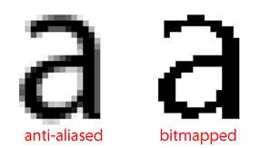
Anti-aliasing or “font smoothing” is a process to make your images look smooth and your text more readable.

Anti-aliasing or font smoothing is a technique to make flat color images and text look smoother on grayscale GLCD screens. The font generator in the Bitmap2LCD tool features font smoothing for 16 grayscale OLED GLCD (4 bit pixel depth)
A graphic liquid crystal display shows an image in bitmap mode. It means that every image is really a bunch of tiny little squares that make up the image. In other words, fonts on monochrome GLCDs or monochrome fonts displayed on grayscale GLCDs, can’t display chars with smooth curves. With anti-aliasing, the curve is created with squares of color that are shaded darker or lighter depending on how much of the curve would take up that square. For instance, if a portion of a curve takes up 10% of a pixel, that pixel would be shaded with 10% of the color saturation of the curve, in fact in case of a 16 grayscale level GLCD, the nearest gray level of the 10%
Anti-aliasing Pros and Cons
Pros
- Makes fonts look smoother
- Rounded edges look round
- Type is easier to read (for some) because it looks more like what printed type looks like
- Some people feel it’s prettier
Cons
- Small fonts become too fuzzy to read
- Sharp edges may be fuzzy and not precise
- You can’t print anti-aliased text as it comes out blurred
- Images are generally larger
- Type is easier to read (for some) because the blurring is reduced and the fonts are clear
Note : This post summarizes information found here and there on the web
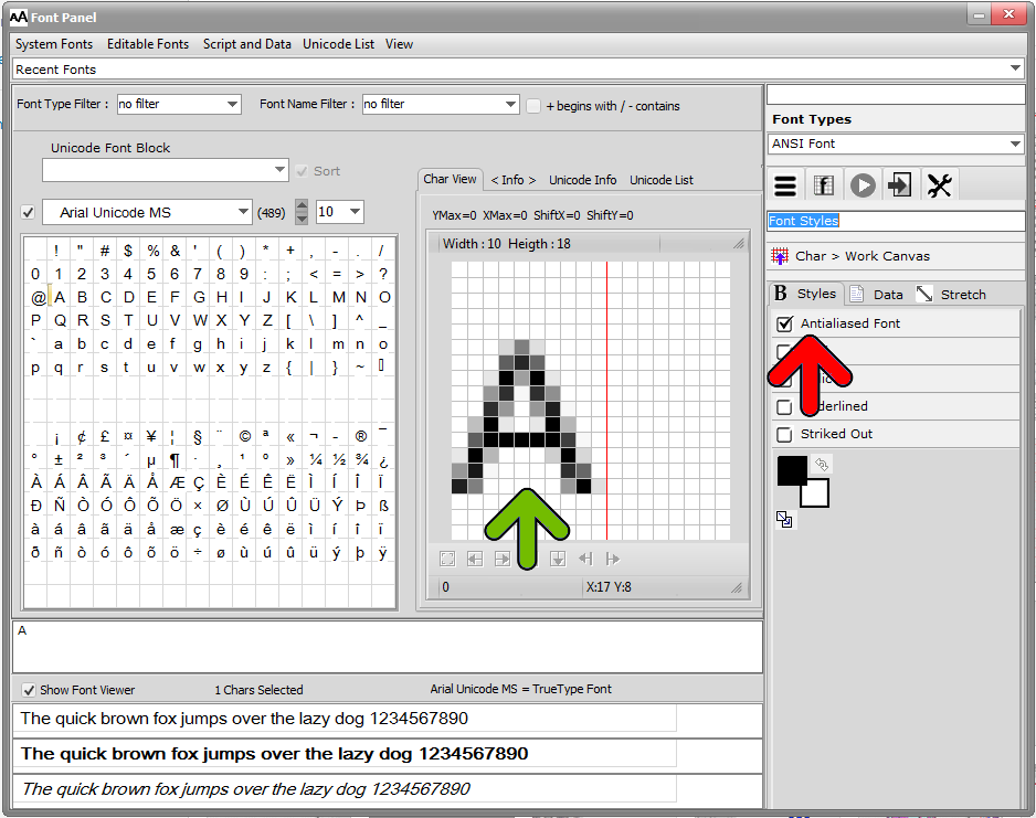
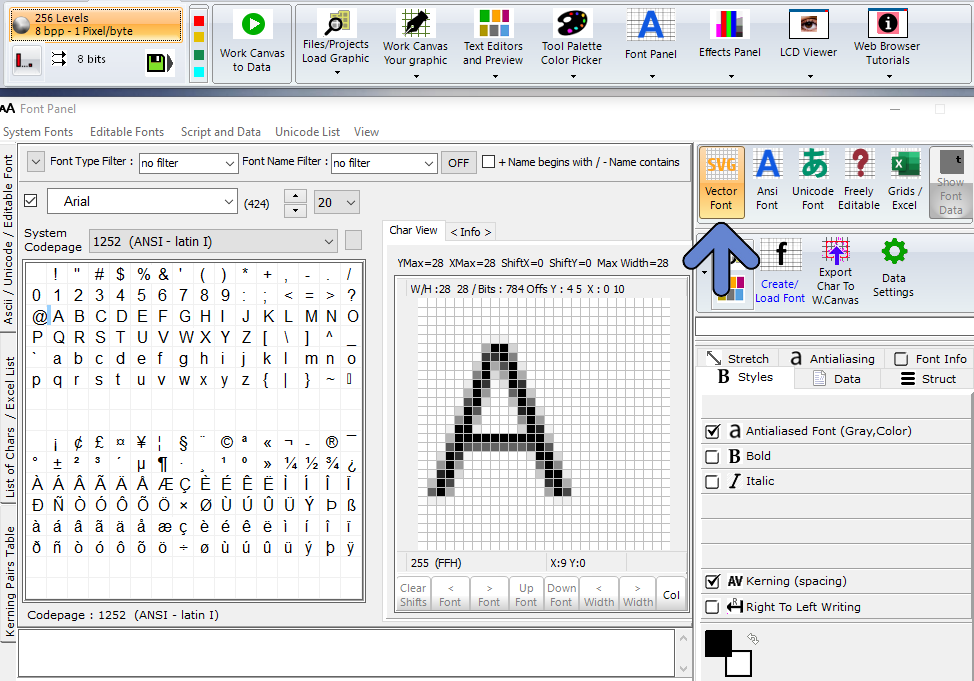
Example of an Antialiased Character View in the Bitmap2LCD Font Panel

